My Design Proposal For Hive Book Club

Greetings friends, I recently found out about the design contest for the Hive Book Club community. I found it very interesting and I took the time to think of a good proposal and bring you a series of designs that might be interesting for the community.
First of all, I'll tell you what inspired me and how I designed this logo.
Inspiration
Obviously I sat down to do a lot of sketches on paper, because I find it more practical to capture my ideas on paper before capturing them digitally, because on paper and pencil you can erase and do it again in case you don't like something, or just look for another side of the paper and keep creating, that's what I like about paper.
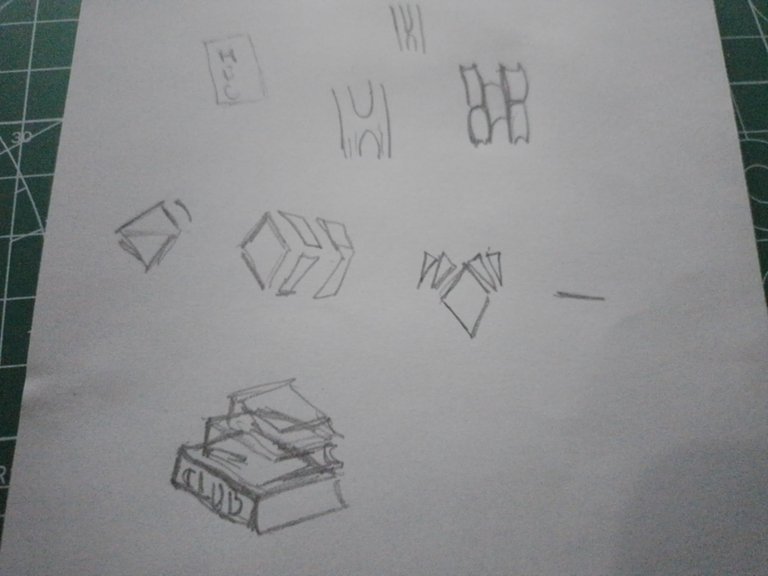
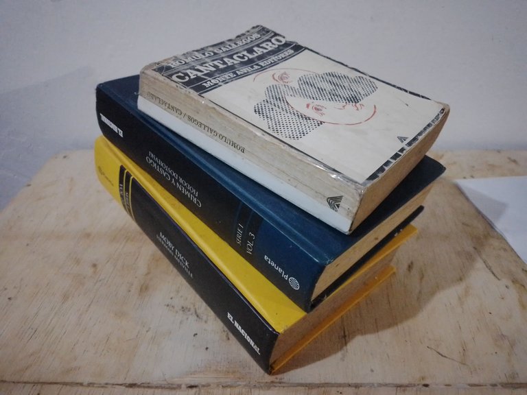
That's how I came up with the idea for my logo, some books stacked on top of each other. I had the books drawn in my sketch, as you can see above, so I took a few from my book collection, stacked them up and took a picture of them.
This was more than enough to inspire me and help me make the logo you see not only in the thumbnail of the post, but below.
Logo
As I said, the logo was inspired by the photograph of the books you see above, so the next step was to digitize these books and capture them in such a way that it is minimalist but retains the essence of the community, the books.
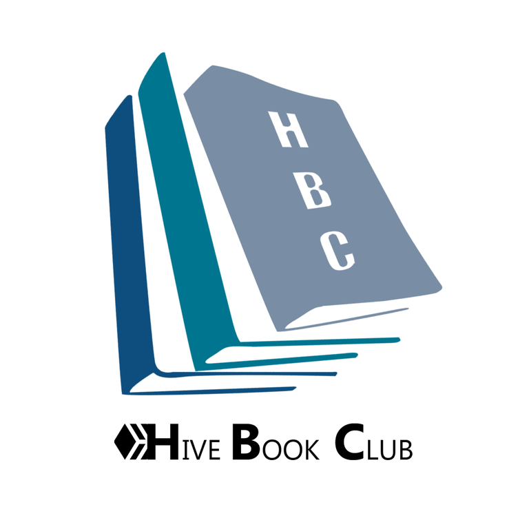
In my opinion it looks quite serious, professional and striking to the eye, as it is quite elegant.
Below you can see the logo I made with a white background, in circular logo, and without background, in PNG format.
 |  |
|---|
And don't think that color can be an impediment, no, here you can see that the color of the logo can easily be changed to different shades, being these each one of the color palettes that were recommended to us in the contest publication.
As you can see, it is a simple logo, adaptable and easy to play with.
 |  |  |  |
|---|
 |  |  |  |
|---|
 |  |  |  |
|---|
Divider
For the dividers I had to make a new PNG of the logo, this time without the text "Hive Book Club" that it has in the images above.
You can see below how the logo looks like without this text:

The idea was to have a clean image of the logo so I could fit it to all these separators that you can see below. I made two designs that, again, can fit different color palettes.


Banner
The design of a banner can be very subjective, since tastes depend on each person, but I focused on the word "professional", so I tried to be as professional as possible and bring an elegant and fresh banner design for the community.
I like blue, it is one of my favorite colors; however, this banner design, as well as the logo, can easily be adapted to other colors, as I show below.
I placed the texts "This Week in the Hive Book Club" and "Join us to the Hive Book Club", being the first one the one that would serve as a thumbnail for your publications, and the second one as a sort of footer or final banner.
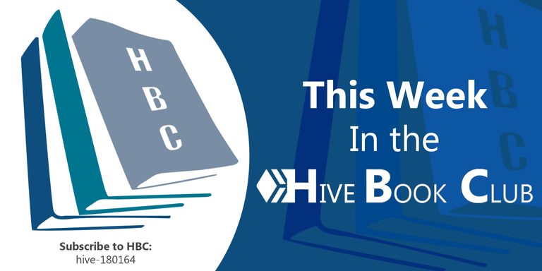
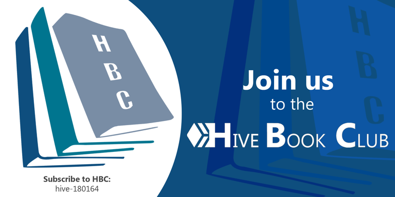
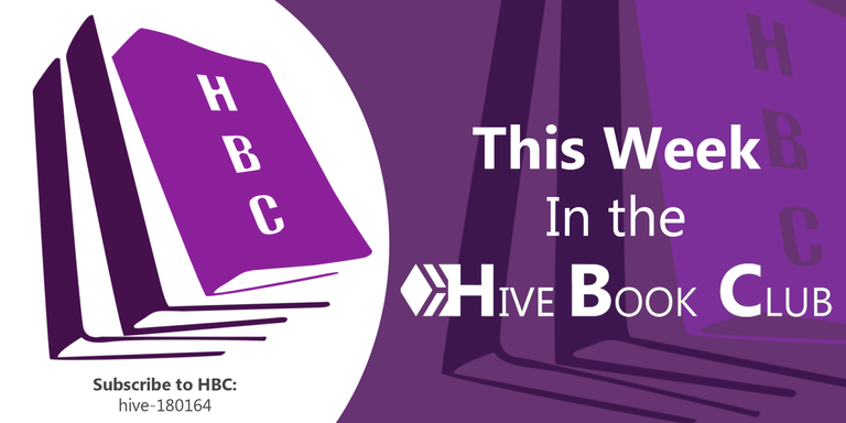
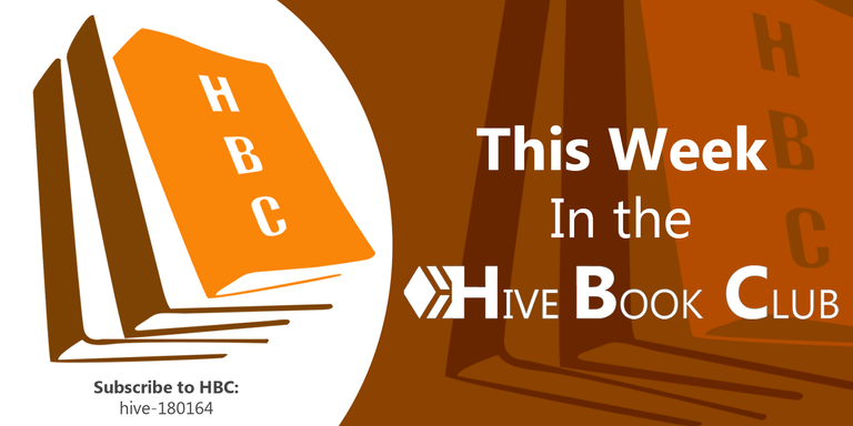
As you can see, they are pleasing to the eye, elegant, not overloaded and adaptable to different types of colors and even to future new designs. Which I would be happy to do if you allow me to do so.
And that's all for now. I hope you liked the designs. I invite you to leave your opinions below in the comments, as always I will be happy to read them.
I appreciate that you took the time to read me, without more to add, I'll say goodbye then...
See you next time!

This proposal is very nice, simple but wao! It is very stylish and I would love to have this banner in HBC publications. Great job
!VSC
!LUV
@chacald.dcymt has sent VSC to @gaboamc2393
This post was rewarded with 0.1 VSC to support your work.
Join our photography communityVisual Shots
Check here to view or trade VSC Tokens
Be part of our Curation Trail
@chacald.dcymt ha enviado VSC a @gaboamc2393
Éste post fue recompensado con 0.1 VSC para apoyar tu trabajo.
Únete a nuestra comunidad de fotografía Visual Shots
Consulte aquí para ver o intercambiar VSC Tokens
Se parte de nuestro Trail de Curación
gaboamc2393, chacald.dcymt sent you LUV. 🙂 (1/1) tools | trade | connect | daily
Made with LUV by crrdlx.
Well, I did it with the intention of making them look good on the community blog. I'm glad you liked it!
Thanks for the tokens hehehe
This looks really awesome Gabo! thanks for participating last minute :)
I thought I wouldn't make it, but I wanted to submit my full proposal so I took my time to do it. I'm glad you liked it. Best regards!
This is so nice. You have done your best to come up with a unique design