Soul Eater at the Top of the World | Radaquest Fan Art

Time to debut the new Radaquest designs!
There are new Radaquest characters out there, and they caught my eye, so I had to get to work and paint them right away.
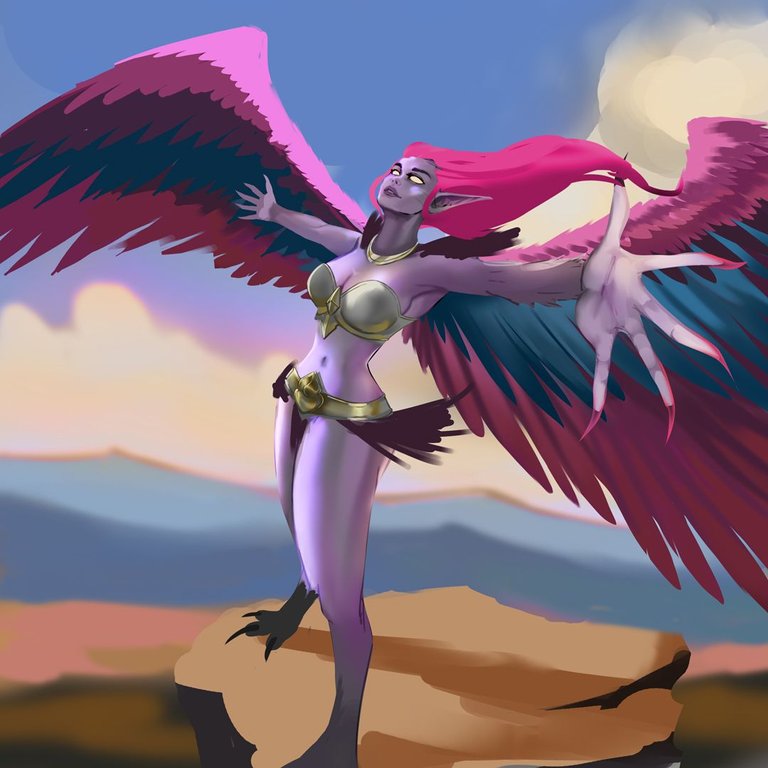
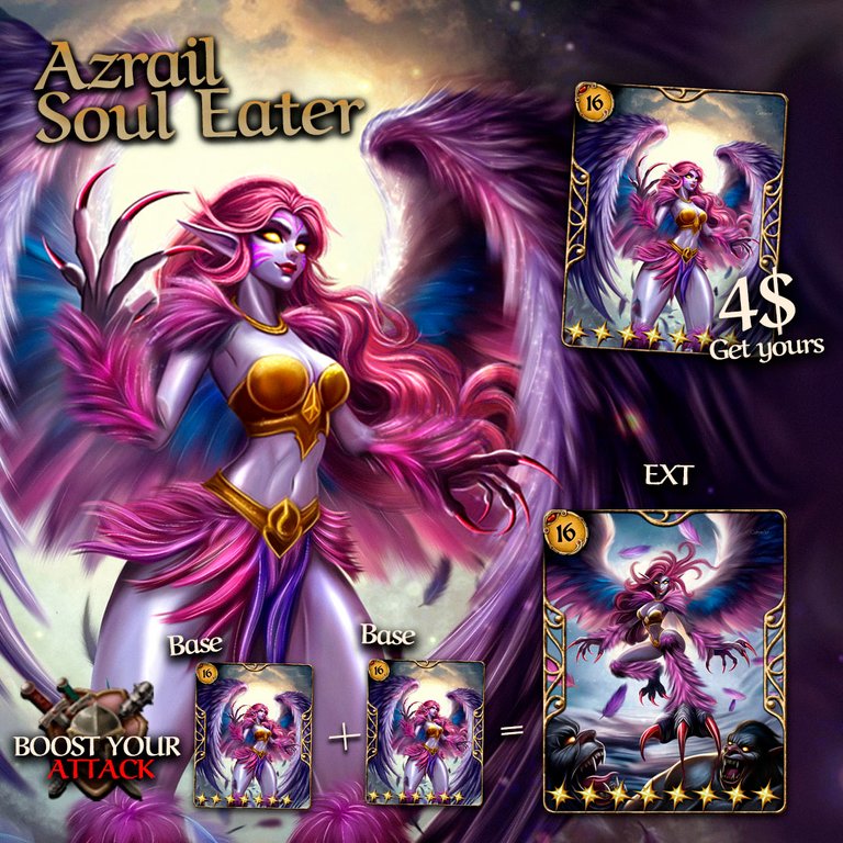
The first one I saw was Azrail Soul Eater, a harpy with deadly claws. I'm 99% sure it was drawn by @catrynart because her painting style is recognizable to me and I love it. So I went straight to drawing this new character, giving it my own touch by pushing the perspective of the scene to the max.

⚔️Play Radaquest Now❕⚔️

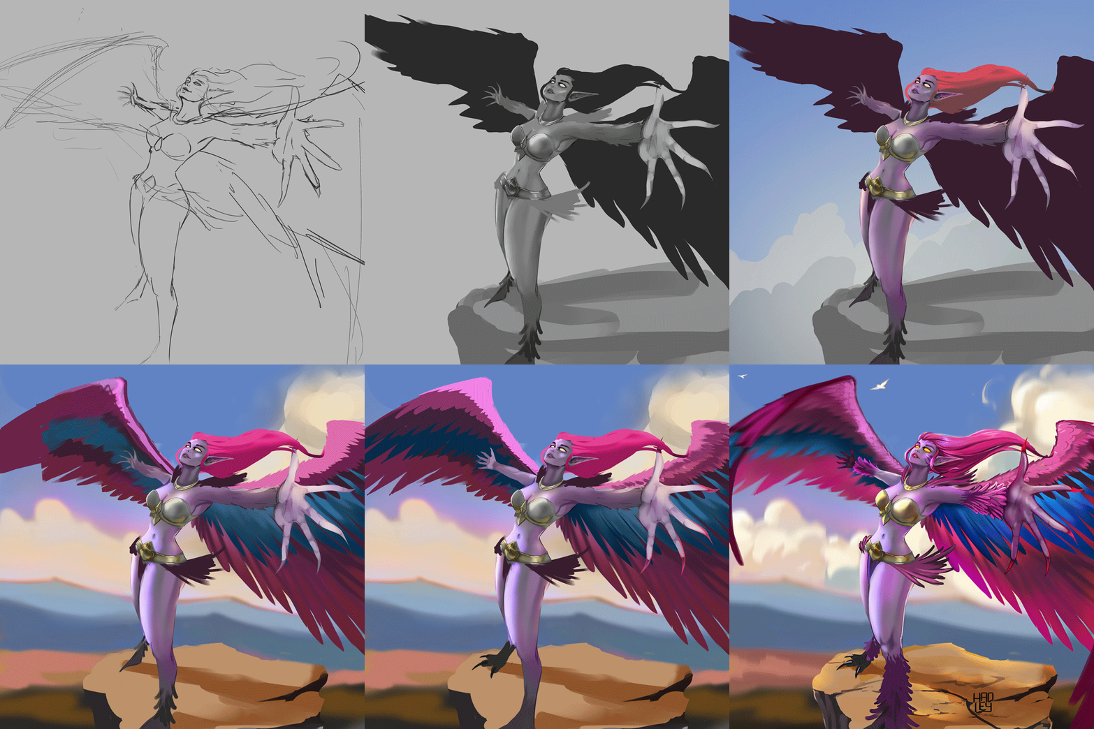
-Step 1:
I really enjoy and learn a lot by pushing the perspective of the scenes I draw, as I feel it adds a special touch to them. That's why Azrail is in the middle of nowhere, dominating the heights and showcasing the freedom she feels at the top of the world.


-Step 2:
In these recent illustrations, I've been using grayscale to enhance the volume and lighting of the characters, and Azrail is no exception. At this stage, I took the opportunity to remove the most prominent lines from the sketch and refine the harpy's face.
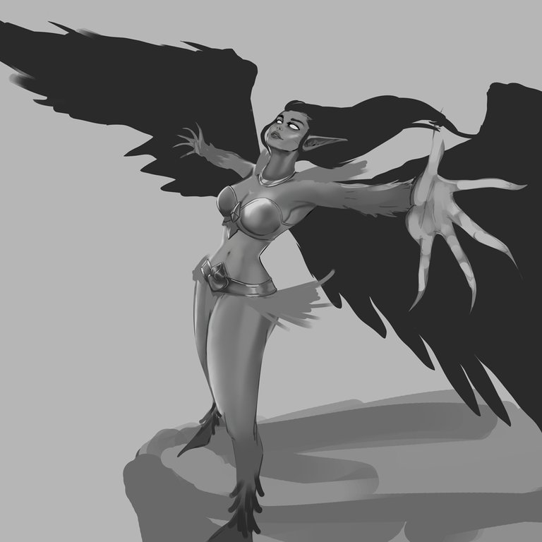 | 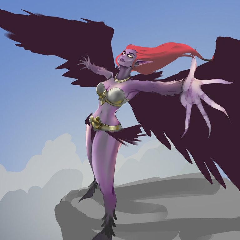 |
|---|

-Step 3:
Since the harpy's color palette was predominantly pink, I searched for new background colors that would make her stand out. I considered a sunset, but the pink and intense orange didn't complement each other well. Instead, I opted for a color palette that transitions from cool to warm tones, using the white clouds to separate the character from the background.
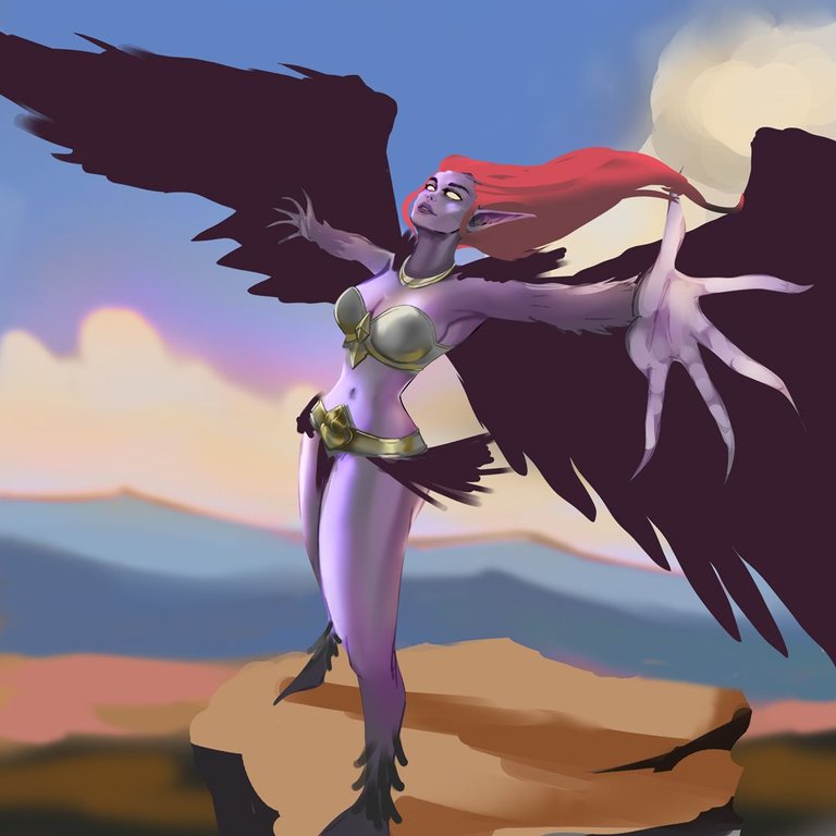 |  |
|---|

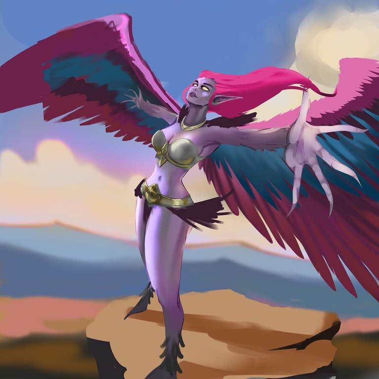
-Step 4:
The real challenge was maintaining the perspective of the wings, especially her left wing. It was extremely difficult to make it look distant, and I still feel that the arm isn't proportional to the wing. However, I was able to make the claws on her feet look good, as I was concerned that the harpy wouldn't appear properly grounded.

-Step 5:
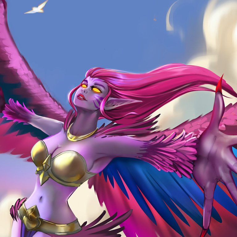
And now it's time to feather the harpy. I tried to paint her feathers without being overly detailed since there were so many of them. However, I did spend quite a bit of time on the wings to achieve a good transition between blues and pinks. I also took the opportunity to balance the lighting so that the arm and the left wing wouldn't draw too much attention and would be the elements closest to the camera where the viewer's focus is directed.


I will leave you a GIF with the whole process on it, so you can better appreciate the illustration process.

See you in a future post!
Thank You for Supporting My Artwork
TWITTER | GHOSTMARKET |TERRA VIRTUA |NFT SHOWROOM | INSTAGRAM | FACEBOOK
⬆️ Follow ⬆️



Fantastic job! ❤️Me would love to see how you develop it in other rows and perspectives is a character with a lot of freedom😘 best of luck in your participation!
Amazing Amazing Amazing @hadley4!
I love that pose and colors