My Entry: Graphic Design Contest
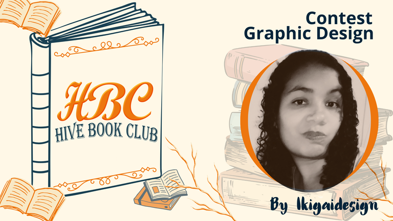
I wish I could talk about the last book I read, but the truth is that I haven't read for a long time, I always think about wanting to do it, but I haven't been motivated, I get distracted by other things, the day goes by, time passes, and nothing, I even joined a book club through Telegram.
However, what I have liked most in recent months, is to create, design a little, and although it is not something I do consistently, from time to time, I get to see what I get, that's why, when I saw this publication, to create a new image to this community, I said why not, I'll try, and so, maybe I encourage me a little to resume reading.
It was a long process, I did not know where to start, I wanted to play a little with the initials of the community HBC, after so much testing, I decided to make this gradient effect with one of the proposed colors, the Saffron, the fonts, well, I based mostly on that type of modern and simple letters.
Once this was done, I did not know how to place it, I thought many ideas regarding the shape of the book, between open or closed, but in the end I took this one, closed, placing the letters as the cover of the book, with some astethic decorative lines, combined with another color, the Classic Blue.
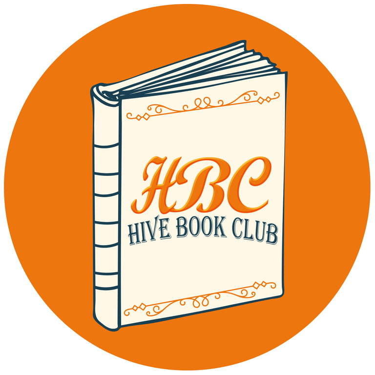
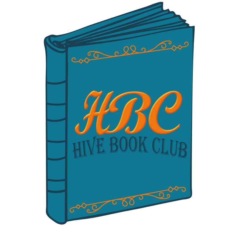
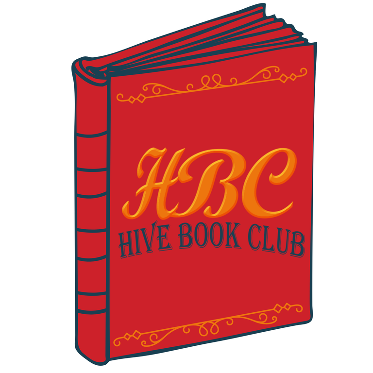
On the other hand, I also wanted to play with the other colors, since the image itself lends itself to different combinations, it would be up to your taste, but for me, I liked the first one the best, I don't know what you say.
 |  |
|---|
As my favorite was the first one, I based on this color to make both the divider and the banner; another detail that I also took into account to make, is that when I think of books, I like those stories that are based on the medieval times, the old, so I based on it for the design of the same, with this color combination.

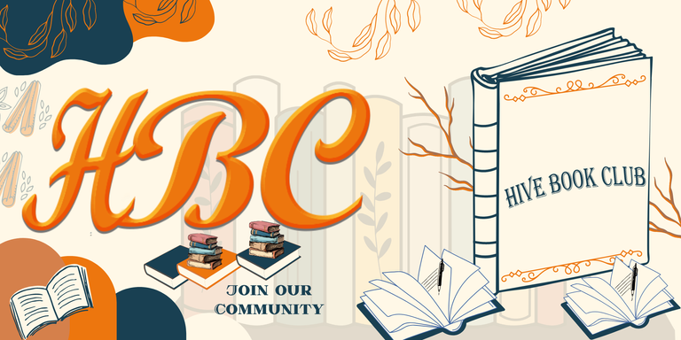

I worked with Photoshop for the design of the initials, the rest was handled with Canva.
This is all, I hope you like it, I am at your service, for any adjustment to the design, a pleasure to have participated, and I also hope to activate me to read a good book, I accept suggestions.
| RECURSO / RESOURCE | FUENTE / SOURCE |
|---|---|
| Imágenes / Pictures: | |
| Translation/Traducción: | DeepL Traductor |
| Edition/Edición : | Cover and banner with Canva |

https://inleo.io/threads/ikigaidesign/re-leothreads-2lzw3qztm
The rewards earned on this comment will go directly to the people ( ikigaidesign ) sharing the post on LeoThreads,LikeTu,dBuzz.
te quedó bien chévere, a mi siempre me han gustado ese estilo de letras y no sé por qué pero cuando pienso en libros suelo recordar el estilo gótico lleno de misterio y elegancia y eso es lo que tu logo me refleja, quedó genial!
Si yo creo que en eso estaba pensando, cuando realice el logo, quería algo así elegante, profesional, distinto, no sé si di con lo que buscaban, pero hice el intento jiji, me alegro de que te gusto amiga. 🤗
Muchas gracias😍
Quedo muy lindo amiga, colores y sibre todo la elegancia del trabajo. Muy bien ❤️
You have created a welcoming design. Well-done