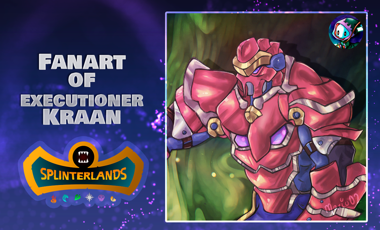
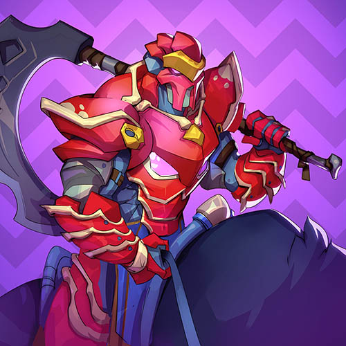
Executioner Kraan Fanart- Splinterlands Art Contest Week 313! [ESP/ENG]

Greetings aliens! I hope you are well and in good health. In this opportunity, I want to share with you an illustration that I finished last night, but I was too late, so I preferred to leave it for today.
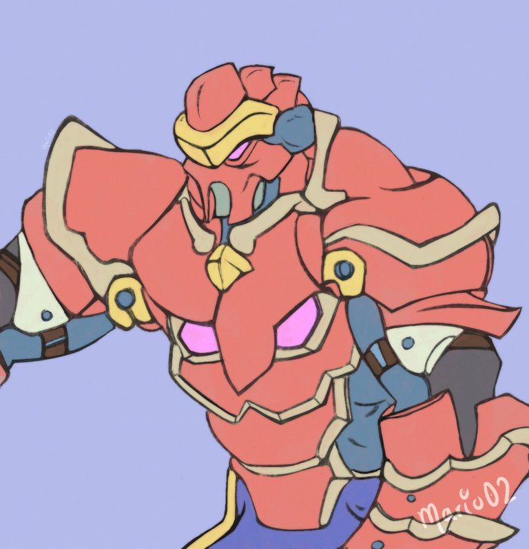
Today's illustration is my participation to this week's @splinterlands contest. This time, I took as a reference the character Executioner Kraan, he has always caught my attention because of his vibrant colours and he is one of the most different (colour wise) from his element Death. I hope you like this version and before I start with the process, I want to thank you for the support that you have given me 🙏
! [Spanish version]
¡Saludos aliens! Espero se encuentren bien y con mucha salud. En esta oportunidad, quiero compartir con ustedes una ilustración que culmine ayer en la noche, pero se me hizo muy tarde, y preferí dejarla para hoy.
La ilustración del día de hoy, es mi participación al concurso de @splinterlands de esta semana. En esta ocasión, tome como referencia al personaje Executioner Kraan, este siempre me ha llamado la atención por sus colores vibrantes y es uno de los mas diferentes (en cuanto al color) con respecto a su elemento Muerte. Espero les agrade esta versión y antes de comenzar con el proceso, quiero darle las gracias por el apoyo que me han brindado 🙏
Creative Process | Proceso Creativo📘✏️
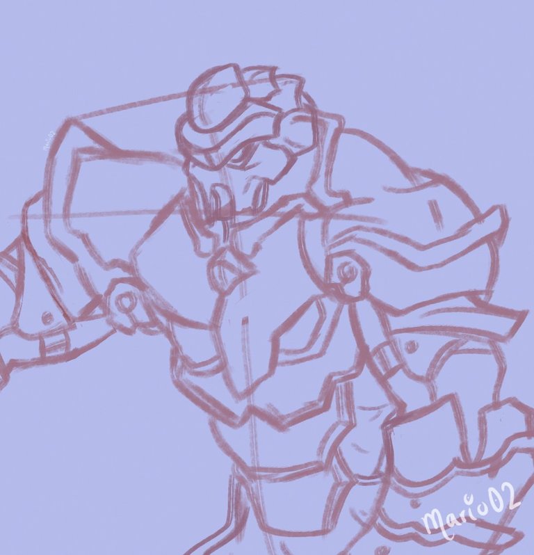
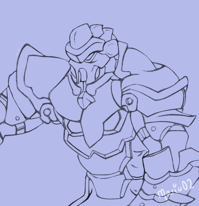
I started with the sketch of the character, this time I decided to start directly, just using guide lines to place the direction of the character in space. In this step, I used a large textured brush, which helped me a lot to give shape and volume to the character quickly. I decided to clean up these sketch lines with the eraser, to form what would be the lineart.
! [Spanish version]
Inicie con el boceto del personaje, esta vez decidí comenzar directamente, solo utilizando líneas guía para ubicar la dirección del personaje en el espacio. En este paso, utilicé un pincel grande con textura, el cual me sirvió muchísimo para dar forma y volumen al personaje rápidamente. Decidí limpiar estas líneas del boceto con el borrador, para formar lo que sería el lineart.
I then started to take colour samples from the reference image, changing the saturation of the tones for a softer finish. I filled with red the whole character, and in several layers I placed all the colours of the elements keeping a layer order.
! [Spanish version]
Después, comencé a tomar muestras de color de la imagen de referencia, cambie la saturación de los tonos para un acabado más suave. Rellene con el color rojo todo el personaje, y en varias capas fui colocando todos los colores de los elementos manteniendo un orden de capas.
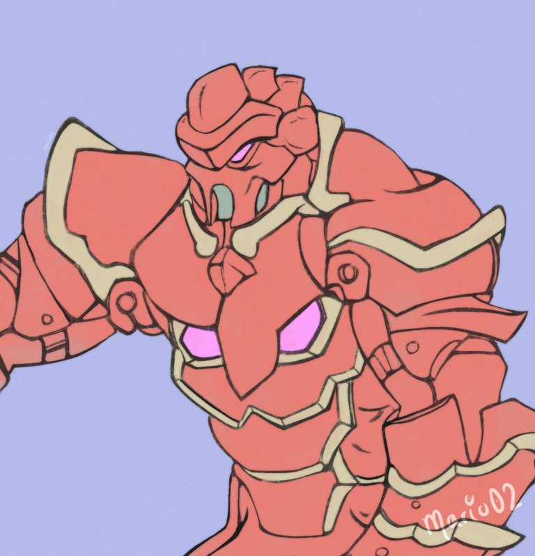
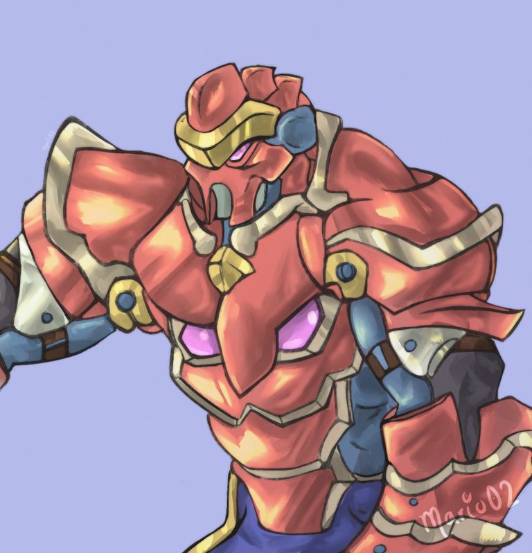
With a hard brush of low opacity, I worked on the shadows, as it was an armour I tried to apply the shadows thinking about each element separately, but keeping a direction where the light would come from. Then I applied the lights with a light tone, in blending mode Highlight and I started to blend with my finger some parts of the shadows and lights for a better integration.
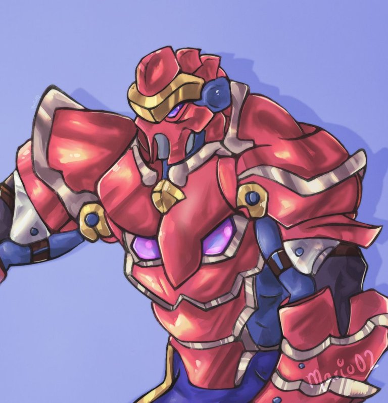
Although I was liking the finish, I somehow felt that the character looked lifeless, so I applied a purple colour all over the character, using the layer blending modes. This colour layer allowed me to saturate the colours a bit more and give the character a more vivid touch, which I think gave him the touch that this work needed.
! [Spanish version]
Con un pincel duro de baja opacidad, fui trabajando en las sombras, al tratarse de una armadura trate de aplicar las sombras pensando en cada elemento por separado, pero manteniendo una dirección de donde vendría la luz. Después aplique las luces con un tono claro, en modo de fusión Luz Fuerte y comencé a mezclar con el dedo algunas partes de las sombras y luces para una mejor integración.
Aunque me estaba gustando el acabado, de cierta manera sentía que el personaje se veía sin vida, por lo que aplique un color violeta en todo el personaje, utilizando los modos de fusión de capa. Esta capa de color, me permitió saturar un poquito mas los colores y darle un toque mas vivo al personaje, el cual considero le dio el toque que necesitaba este trabajo.
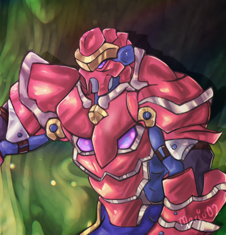
Final Art | Arte Final
To finish, I made a green background to contrast the red colour of the character's armour, I also added some minimal ambient lights, to better integrate the character. What did you think of this fanart? I hope you liked it and see you in a next post.
Thank you very much for all the support! 🙏
! [Spanish version]
Para culminar, realice un fondo de color verde para contrastar el color rojo de la armadura del personaje, también agregue algunas luces mínimas de ambientación, para integrar mejor al personaje. ¿Que les pareció este fanart? Espero les haya gustado y nos vemos en un próximo post.
¡Muchas gracias por todo el apoyo! 🙏
Tools Used | Herramientas Utilizadas:
- Photoshop CC versión 64 bits
- Tablet Huion H610 PRO V2
REFERENCE
The illustration and separators used in the post are my property.
Translated with DeepL (free versión)
El efecto de la sombra y me pareció bastante bueno, le felicito por el diseño.
Muchas gracias por el comentario amigo!
Me alegro un montón que sea de su agrado 🙏